When it comes to web design that performs well in search, few decisions matter more than how your site adapts to different devices. In 2025, Google’s focus on user experience is sharper than ever, and your design approach plays a direct role in how your content is crawled, indexed, and ranked.
The debate between responsive and adaptive design isn’t new, but with AI-powered rankings, Core Web Vitals, and shifting user expectations, the stakes are higher now. If you’re serious about SEO, understanding how these two design approaches stack up could make the difference between a site that ranks and one that lags behind.
What Is Responsive Design?
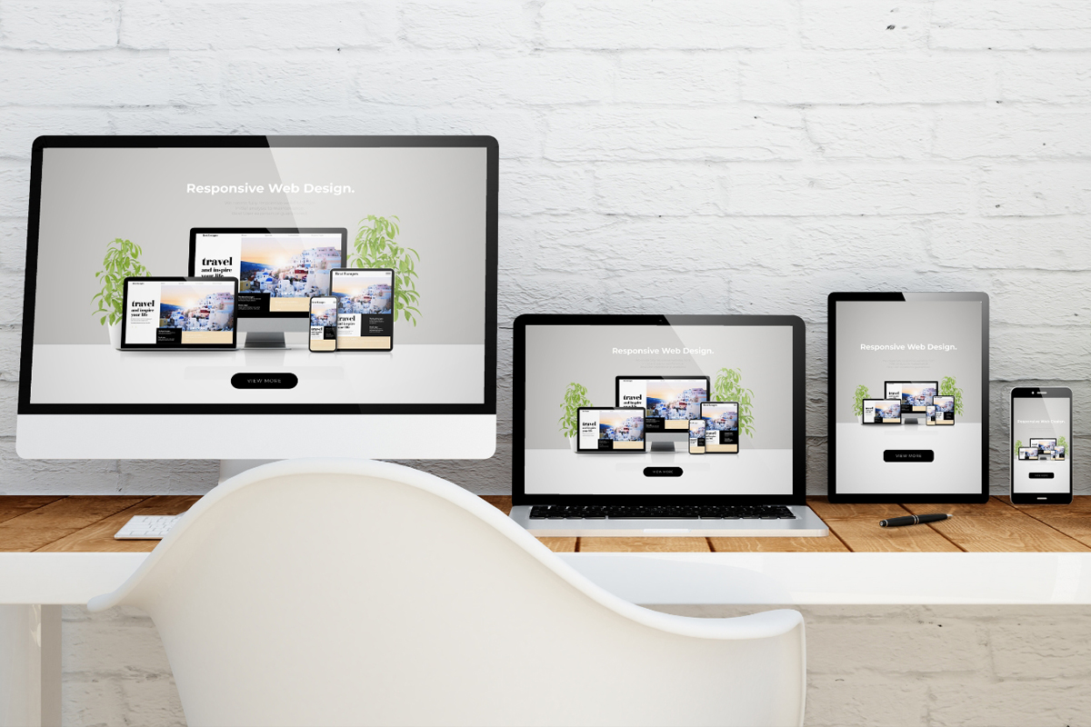
Responsive design uses flexible grids and fluid layouts that automatically adjust based on screen size. A single set of HTML and CSS adapts to all devices, whether someone is visiting from a phone, tablet, or desktop.
Key features:
- One URL and codebase for all devices
- Layout adjusts in real time
- Google’s preferred approach for SEO
What Is Adaptive Design?
Adaptive design uses multiple fixed layout sizes. The website detects the device and serves a specific version of the site that’s optimized for that screen.
Key features:
- Multiple templates for different screen types
- Static layouts tailored to common devices
- Slightly faster initial load on certain devices
Why Google Favors Responsive Design
From an SEO perspective, responsive design holds a clear advantage. Google has explicitly recommended responsive sites because they’re easier to crawl and index. With a single URL for all users, there are no duplicate content concerns or signals split across versions.
Here’s why responsive design continues to win:
| Factor | Responsive Design | Adaptive Design |
|---|---|---|
| Crawl efficiency | ✅ One set of URLs | ❌ Multiple templates increase complexity |
| Mobile-first indexing | ✅ Fully compatible | ❌ May require extra attention |
| Backlink consolidation | ✅ Links point to one version | ❌ Links may be split across device templates |
| Maintenance | ✅ Easier to manage | ❌ More complex updates required |
What’s Changed in 2025?
In 2025, responsive design isn’t just about screen resizing, it’s about responsiveness to intent and performance expectations. Google now factors in:
- Loading performance by device
- Interaction readiness (tap targets, scrolling)
- Consistent experience across screen sizes
Responsive sites that go beyond layout to optimize UX signals, such as page speed, clarity, and accessibility, tend to outperform.
Adaptive design, while sometimes faster for specific devices, can fall short if the experience isn’t consistent across all breakpoints or if updates aren’t managed carefully.
When Adaptive Design Can Work
There are a few exceptions where adaptive design might still make sense:
- High-end platforms serving very different user experiences (e.g., a B2B portal vs. public-facing site)
- Apps or landing pages with unique mobile interactions that require device-specific experiences
- Heavily branded experiences that demand pixel-perfect control per device
But in these cases, it’s essential to manage redirects, canonical tags, and content parity to avoid SEO pitfalls.
Which One Is Best for SEO?
If your goal is to rank well in Google, maintain a healthy site structure, and provide a consistent user experience, responsive design is the clear winner.
It simplifies:
- Indexing – One version to crawl
- Link Equity – All backlinks boost one URL
- Maintenance – Fewer errors and updates
- User Experience – Consistent and predictable
Unless your site has a very specific technical requirement that demands adaptive design, responsive design gives you the most future-proof and SEO-friendly foundation.
Design isn’t just about how your website looks, it’s about how it functions across every screen and how Google sees it. In 2025, responsive design continues to offer the strongest mix of flexibility, SEO performance, and scalability.
If your site still relies on older adaptive templates or desktop-only layouts, now is the time to upgrade. Because when your website adapts well, your traffic, and your leads, tend to follow.
Need help evaluating your site’s design for SEO performance?
We specialize in SEO-friendly website design that balances structure, speed, and strategy, built with both users and search engines in mind. Let’s talk about what’s next for your business online.